Intro
Hey all!
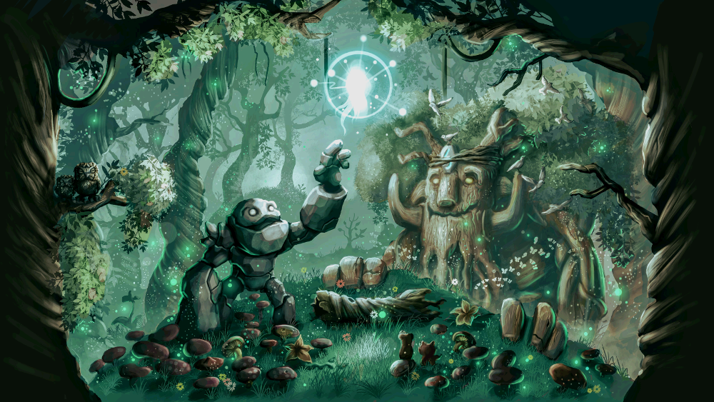
Welcome to this digital painting walkthrough/tutorial of “The Beginning of a Beautiful Friendship”, a Dota loading screen I made as a submission to Valve’s workshop.
Concept
I had this idea in my head for a while now, where I would depict the first meeting of two often paired heroes in dota matches in a more light hearted setting.
The two heroes in question are Tiny and IO. Tiny is a rock creature that grows in power and size as the game progresses and IO is a magical ball of light with teleportation powers which specializes in empowering it’s allies. Together they make a formidable combination. As this meeting takes place in a forest, the meeting will be observed by one of the forest’s oldest dwellers, the treant protector.
Setup
What I used:
Pressure sensitive tablet – Yiynova MSP19U+
Painting Software – GIMP
General technique
I have always been clueless with colors and if you are anything like me, I recommend using the ‘underpainting’ technique which is basically doing everything in grayscale and then overlaying colors.
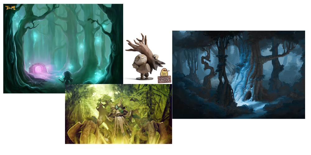
References
I collected some references for several purposes:
- Likeness of the characters
- Values of the scene and background
- Tree details
Draw lah!
Valve’s workshop guidelines state that the recommended resolution for a loading screen is 1600×900, so I doubled that and created a 3200×1800.file.
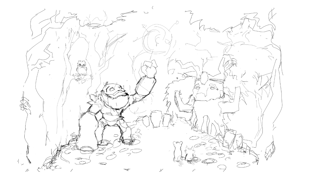
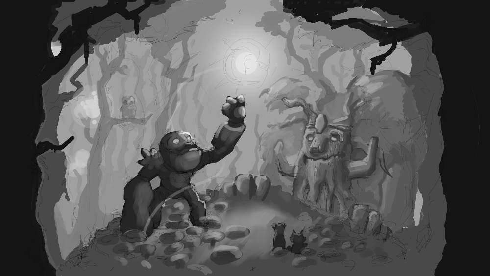
I start by creating a simple sketch, outlining the main elements of the scene. Tiny will be reaching out to IO in wondrous curiosity while Treant Protector will be observing with a comforting smile on his face much like how a parent would observe a child.
The game of Dota includes various little animal couriers that help you deliver items to your heroes and I try to include them in the scene (little ferret and fox right at the front of the scene ).
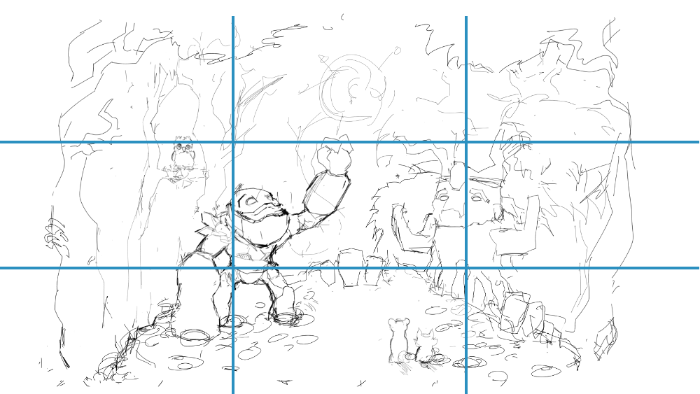
I try to make use of the “Rule of thirds”.
Quoting https://en.wikipedia.org/wiki/Rule_of_thirds
“The guideline proposes that an image should be imagined as divided into nine equal parts by two equally spaced horizontal lines and two equally spaced vertical lines, and that important compositional elements should be placed along these lines or their intersections”
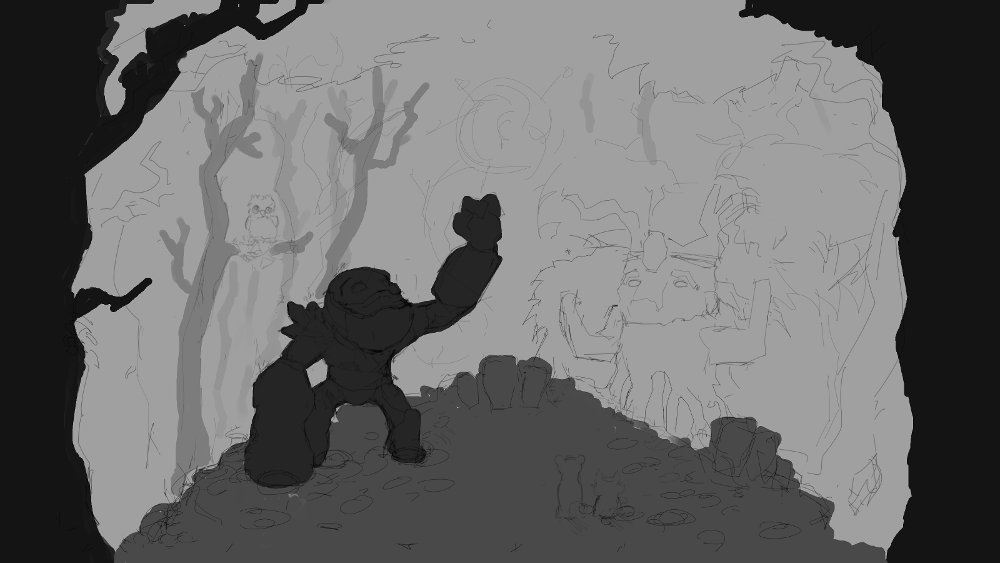
I keep the sketch layer on top and I start blocking in greys of different values on different layer. You may create as many layers as you want, but I try to limit my layer count to about 5 layers (It can get really messy and confusing!).
For this piece I ended up with 6 layers:
- Particles, floaties, butterflies etc..
- The foliage on the floor at the feet of Tiny the rock monster
- Tiny + the floor he is standing on + the trees that are closest to the viewer ( The 2 trees touching the borders of the picture ).
- Treant protector
- Trees in the background
- Sky
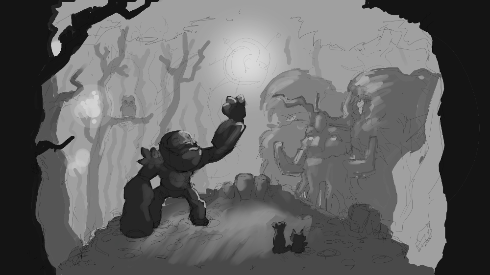
The main light source of the scene will be the ball of light character ( IO ) and I add some basic lighting to the objects in the scene.
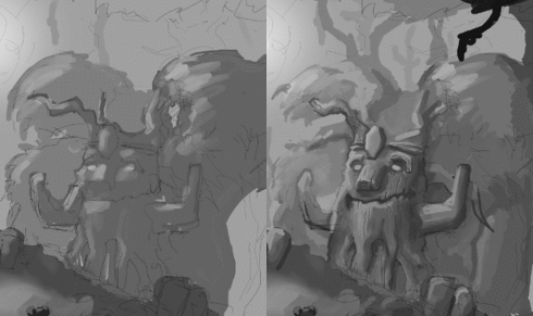
Using darker greys I add details to the treant protector in the background. I try to make the darkest grey on Treant never darker than the darkest grey on Tiny.
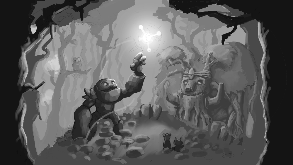
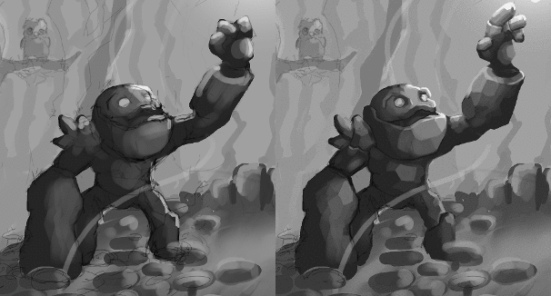
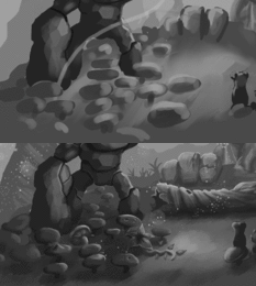
Now some refinement and details on Tiny. Notice as I start to add details, I also erase lines leftover from the initial sketch.
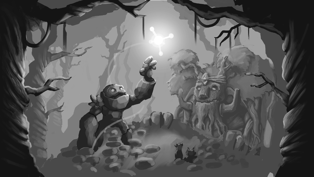
I like windy, spooky looking trees as opposed to straight pine-like trees. I had to redo the details on the trees three times over before I was happy with the results! Remember to keep at it and follow through when working on tedious bits, you can always redo them!
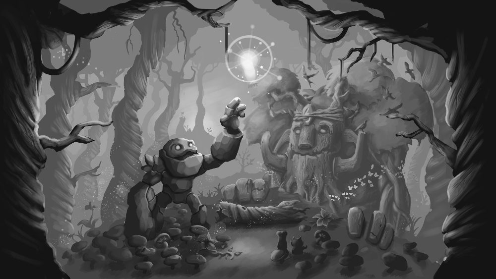
After giving Treant Protector a nose job, I step back and take a look and start to feel satisfied with the overall composition and lighting at this point and start to go crazy on details! I repeat the technique i used to produce the trees a few times into the distance.
I then start to focus on the foliage on the floor by detailing some flowers, mushrooms and vines.
I also add some life to the forest by adding some birds and butterflies. A small light source is added in the distance behind the furthest trees. I try to avoid using the gradient tool when I do this to get a more “painterly” effect.
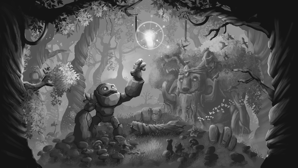
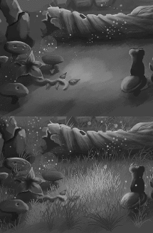
Add some grass and leaves and the scene is really starting to look like an enchanted forest!
The left part of the scene was looking kind of empty so I decide to add a grumpy owl trying to catch some zs.
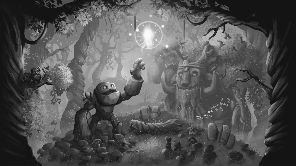
I finish off the scene by giving the grumpy owl a young friend and adding more floating pollen.
I am very happy with the grayscale version of the scene and I can now begin coloring!
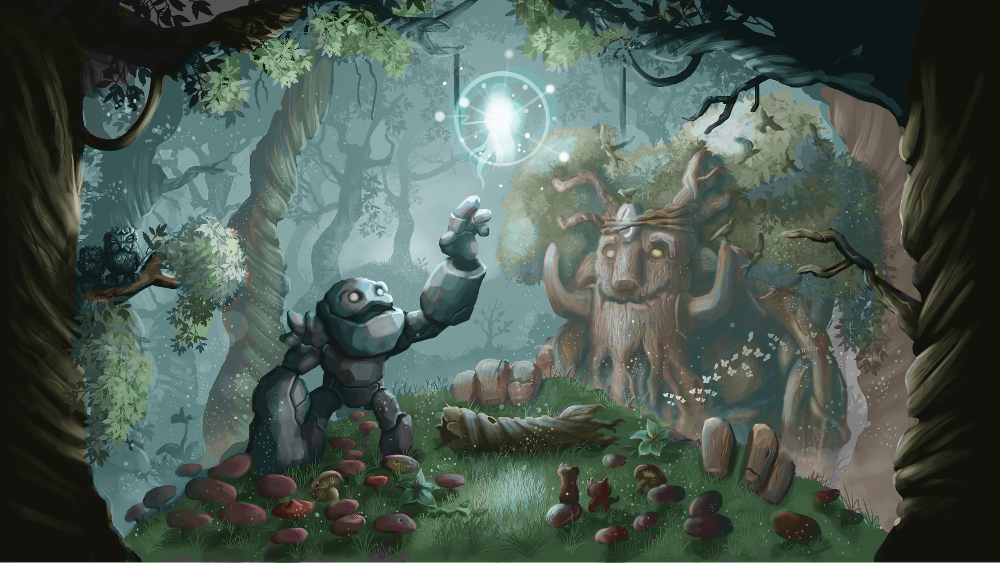
Add an overlay layer and fill it with a light blue to give an overall tint and start coloring the elements of the scene!
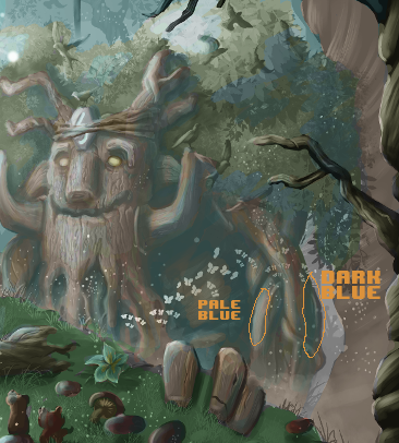
 |
Vary colors of an object depending on lighting. For example the darker parts of the treants are a dark blue, and the lighter parts are a pale blue. |
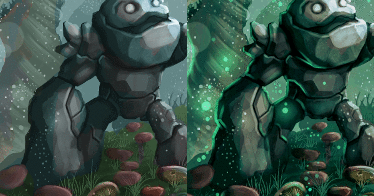
I play around with the color balance a little to change the hue to something I like, and turn up the contrast. I add little glowy creatures so that I have the opportunity to add some backlighting.
 |
Adding a secondary light source is one of those things I consider an x-factor between normal and great looking paintings. |
Conclusion
And we’re done!. I really enjoyed working on this piece and I hope you learnt something from this tutorial/walk-through. Drop me a comment if you have any feedback thanks!


March 11, 2017 at 6:34 am
Thanks, great article.