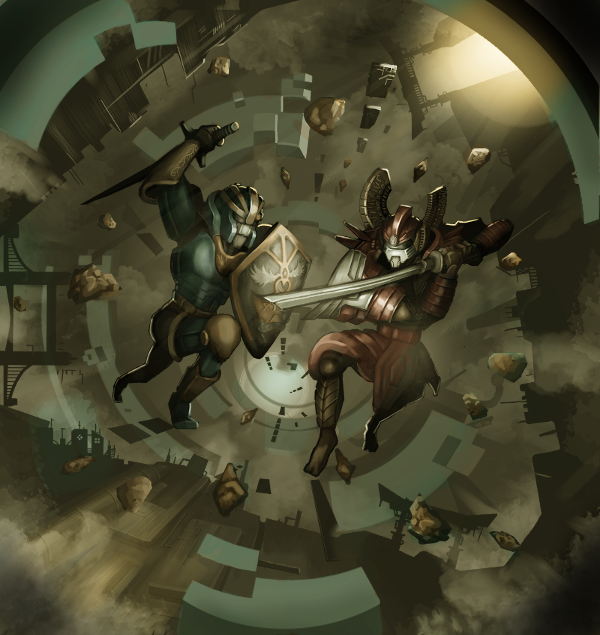
DIGITAL PAINTING GIMP WALK-THROUGH – THE DUEL
Intro
Have you ever stopped and marveled at wonderful works of digital art and wondered if YOU could achieve the same? Well wonder no more! Here is my amateurish attempt at breaking down and providing you the components needed to assemble your masterpiece!
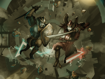
Welcome to this beginner’s walk-through of my third digital painting ‘The Duel’.
What you can expect:
- Clear indications of each small step which I feel brought the piece to the next level.
- More down-to-earth explanations.
Setup
Steady there! As this is my first walkthrough, let’s quickly go through some general pointers:
- Commit to investing some time in your pieces
Don’t be too easily discouraged early on in the process. If your initial drawings are looking awful, try investing at least a couple more sittings to improve them. Never give up!… too soon.
- Do not be afraid to change up your plan
Whatever you envisioned your drawing to be at right at the beginning is not set in stone. If a pose or composition is not working out, don’t be afraid to erase and redraw a whole arm/leg/character/whatever as mistakes and changes are cheap in digital art.
- Get feedback
Don’t be afraid to ask for feedback. Forums are a good place for this and you’ll find many people willing to help.
What I used:
- A pressure sensitive drawing tablet.
I actually attempted my first digital painting without setting up pressure sensitivity! You can achieve almost the same thing in terms of blending colors but it is much more difficult. I used the Yiynova MSP19U drawing tablet.
- Paint software
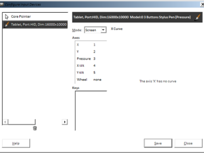
I used GIMP. Photoshop will definitely do, and I suspect Krita will also do. Make sure you can set your device to ‘Screen’ mode in Edit->Input devices:
The combination of the Yiynova tablet + GIMP + dual monitors resulted in some weird problems for me and I solved it by installing a very specific development build of GIMP (gimp-stable-i686-2014-01-26).
- Vector graphics software
Inkscape. Used it to create some geometric shapes for the background.
Concept
Back in my World of Warcraft playing days I used to have a consistent casual 5-man party which comprised of Malaysians, Australians, and a kid from Hong Kong. This excellent experience gave me an idea for a cool T-shirt design.
The concept I had in mind was to illustrate how easy it is nowadays for individuals of very different cultures and geographical locations to clash online in anything from huge epic battles to grueling individual duels. There should of course be cool looking robots to represent their avatars and these avatars should exhibit several features of their respective player’s cultures.
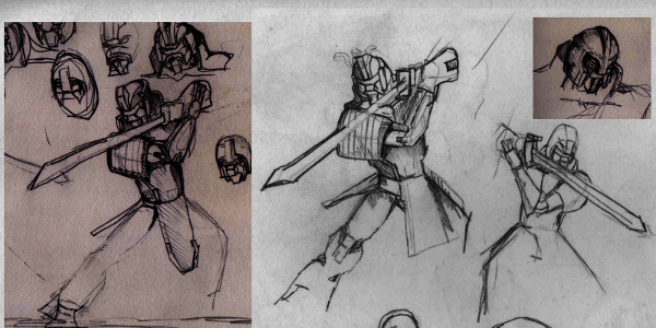
Here were some rough sketches I made while deciding on poses and basic designs of the robots.
The t-shirt design didn’t turn out so well, but ah well, it at least served as a good reference for this digital painting.
General technique
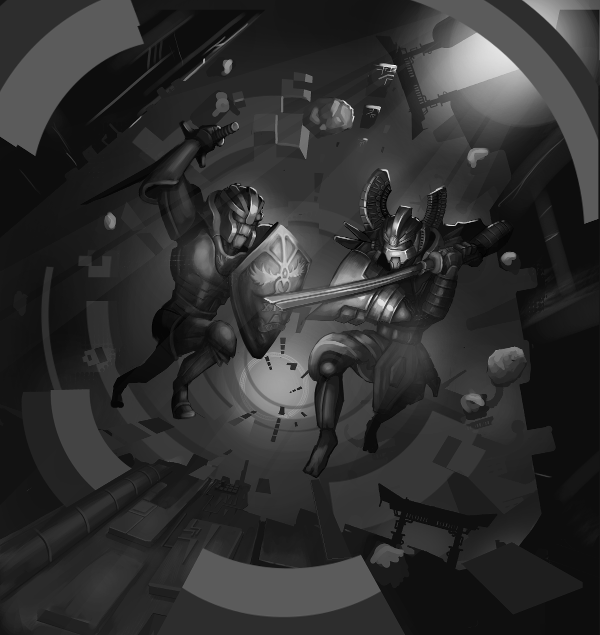
I have always been clueless with colors and if you are anything like me, I recommend using the ‘underpainting’ technique which is basically doing everything in grayscale and then overlaying colors.
Draw lah!
In Malaysia and Singapore, we speak a weird form of english known as Manglish/Singlish. (Lah/Liao/Lor/Ah)s are inserted randomly at the end of our sentences for different meanings. In this case Draw Lah! is for emphasis and simply saying “Let’s get on with it!(Drawing)”.
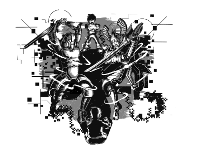
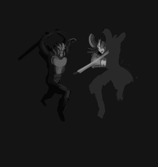
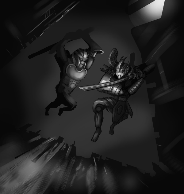
I don’t invest a lot of time into the details just yet and work a little on the overall composition.
 |
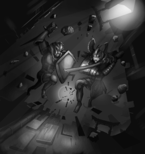
Adding some floating/flying debris and particles can help generate some excitement in your action scenes. |
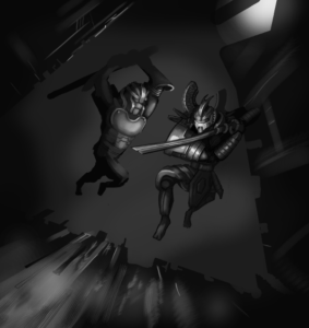 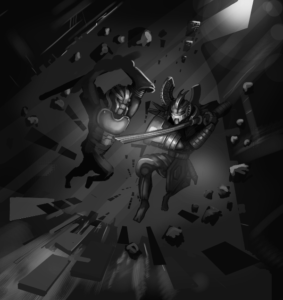
BAM!ACTIONSCENE! |
 |
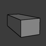
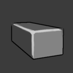
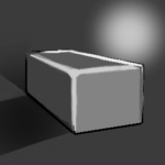
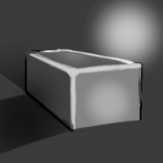
Having sleek wrap around armour as opposed to boxy armour adds an extra level of refinement to your character designs. |
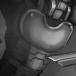 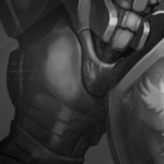 Sexay!. Sexay!. |
 |
Adding layers of reducing levels to the scene is an easy way to add depth to your pieces. |
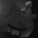 |
 |
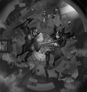
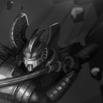
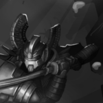
Try to experiment with the highlights and backlighting. Adding more backlights or upping their intensity can sometimes result in a nice effect. |
  |
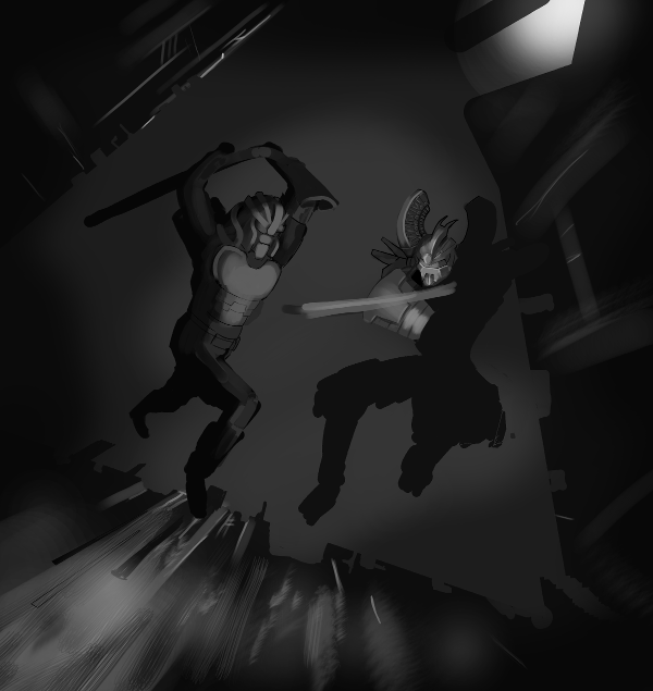
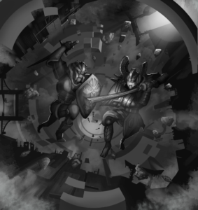
The background was looking kinda boring to me, so I decided to add some sci-fi circles in the background.Try to use a lower level of gray for objects that are further away from the viewer.
 |
If you need to make uniform geometric shapes try to use a vector program. I used inkscape to make a rough draft of the sci-fi circles I want in the background. |
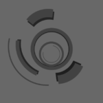 |
Some cut and paste operations later and I end up with the blocky version of the sci-fi circles you see in the picture above. You can see now that parts of these sci fi circles now obstruct the vision some of the background layers, but I decided that it was better and kept it this way.
 |
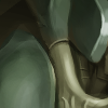
Fade out color at corners and edges to make your objects look worn and weathered. |
 |
 |
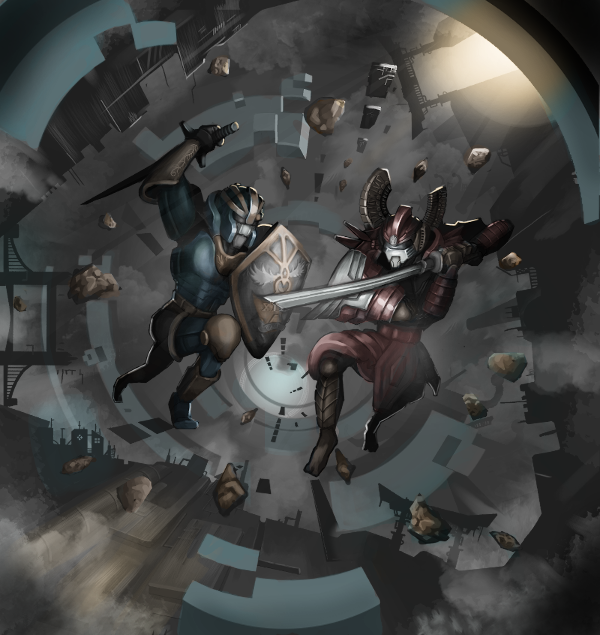
Color the lighting on your objects based on the color of the light source. |
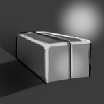 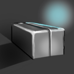 |
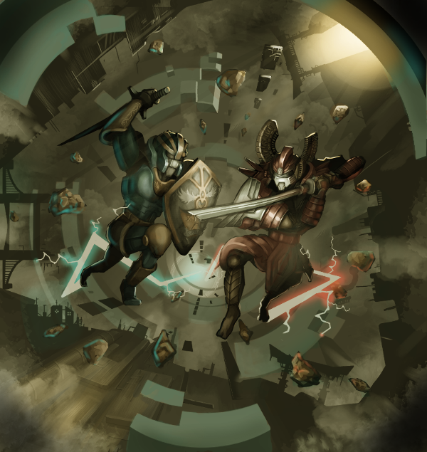
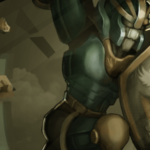
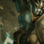
As a finishing touch I add some lightning trails behind the robots to show the general path they were following during this epic duel. I add some ambient lighting sourced from the lightning to the robots and debris.
 |
Use strokes of a soft brush to add ambient lighting. |
  |
Phew, that took longer than expected but we’re done! After all that I feel I need writing classes more than I need drawing classes.
I hope you enjoyed this walk-through and learnt something from it. As I mentioned before I am still a novice, and I hope to show improvement in the next painting I attempt. If you have feedback or criticism send me a message and let me know! okbye!


